
The Psychology Behind Effective Outdoor Advertising Design
Intro
The human brain works fast. Every day, people filter out thousands of images and messages. Most of what we see on the road or in a mall never reaches our conscious mind. To break through this wall, a brand needs more than a pretty picture. It needs to understand the science of how people see the world.
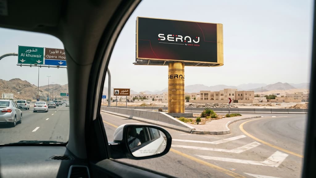
Successful outdoor advertising design is rooted in psychology. It uses the way our eyes move and the shortcuts our minds take. In Oman, where the landscape shifts from modern city skylines to long mountain highways, the way you design for the outdoors matters. If a message is hard to read, the brain simply ignores it.
In this guide, we'll explore the key psychological principles behind effective outdoor advertising design and show you how to create campaigns that capture attention, communicate clearly, and leave a lasting impression on your audience.
The Power of the Split Second
You usually have less than three seconds to catch someone's attention. On a highway, that window is even smaller. This is why simplicity is the most important rule in outdoor advertising design. If a viewer has to think too hard, the campaign has already failed.
The brain looks for a focal point. It wants to know where to look first. A design with too many elements creates "cognitive load." This is just a fancy way of saying the brain feels overwhelmed.
When the mind feels overwhelmed, it looks away. We recommend using one large image, one clear headline, and one recognizable logo. This allows the viewer to absorb the whole message in a single glance.
Visual Hierarchy and the Rule of Three
When we stare at a screen, our eyes take a particular route. Typically, we begin with the most prominent component and work our way down to the minor aspects. This is referred to as visual hierarchy by designers.
The Rule of Three is a trustworthy tactic. Three-person groups are appealing to the human mind. It feels whole and well-balanced. Your design will be easier to recall if it features an eye-catching image, a five-word headline, and a logo.
The message is lost when more information is added, such as a phone number, website, or list of services. Maintain a lean structure. High-impact companies understand that the things you exclude are just as significant as the things you include.
Using Color to Trigger Emotion
Color changes how we feel. It is one of the quickest ways to send a message without using words. However, color needs to work with its surroundings.
In Oman, we have bright sun and clear skies. A design with pale colors might wash out under the midday sun. High contrast is the key to visibility. Dark text on a light background or bright text on a dark background works best.
Beyond visibility, colors carry meaning. Blue often feels professional and stable. Red feels urgent and exciting. Green connects with growth and national pride. We choose colors that stand out against the grey of the road or the beige of the desert. If the design blends into the background, it becomes invisible.
Why Typography Matters for Drivers
Reading a screen while walking is easy. Reading a screen while driving at 100 kilometers per hour is a challenge. The font you choose can be the difference between a successful campaign and a wasted one.
Clean, bold fonts are best. Scripts and thin fonts are hard to read from a distance. We also look at the spacing between letters. If the letters are too close, they blur together at high speeds.
Interestingly, the brain reads lowercase letters faster than all capitals. This is because lowercase letters have unique shapes and heights. All capitals look like a solid block, which takes the brain longer to decode. For a headline on a highway megascreen, a mix of upper and lowercase is often the smartest choice for quick reading.
Dwell Time and the Environment
Where you place your message changes how you should design it. This is based on "dwell time," or how long someone stays in one spot.
On a major highway, dwell time is very low. The design must be bold and minimal. In a fuel station or a government service center, people stay longer. They are often waiting and looking for something to read. In these locations, you can include more information.
Retail hubs and malls are different. People in these areas are already in a "buying" mindset. The design here should be polished and high-value. It should feel like a natural part of the shopping experience. By matching the design to the location, you meet the audience where their mind already is.
The Survival Instinct and Movement
People have an innate ability to detect movement. This kept us safe thousands of years ago. These days, it makes digital screens stand out.
This instinct is used in Digital Out-of-Home (DOOH). On a big screen, a small movement will naturally draw the viewer's attention to it. There is a limit, though. The movement may be uncomfortable or disturbing if it is excessively quick or flashing.
Smooth transitions or a single moving element are used in the greatest digital outdoor advertising designs. This catches the viewer's attention without causing discomfort.
The Importance of Contrast and Scale
Scale is about more than just being big. It is about being seen in proportion to the world. A screen that looks huge in an office looks much smaller when placed next to a six-lane highway.
We evaluate sites based on the line of sight. How far away can a person see the screen? Is there anything blocking the view? A premium design takes these factors into account. It uses large elements that stay clear even from 200 meters away.
If the text is too small for the scale of the road, the reach of the campaign drops instantly.
Cultural Identity and Local Trust
In Oman, brands that feel local earn more trust. Using images that reflect Omani culture and life helps a brand feel rooted. When people see a message that looks like it belongs in their city, they feel a stronger connection to it.
Strategic design isn't just about selling a product. It is about building a relationship. A brand that uses high-quality visuals on a premium screen shows that it is established and confident. This creates a sense of pride and interest in the audience.
Data-Driven Design Decisions
Modern advertising isn't a guessing game. We use data to understand who is passing by our screens. If we know a specific location has high traffic from business professionals, the design should reflect that. It should look professional, clean, and high-end.
If a site has more families and shoppers, the design can be more vibrant and action-oriented. Using these insights helps us place the right design in the right place. This ensures that the message hits the target every time.
Conclusion
Great design is where art meets business logic. It takes the goals of a brand and turns them into a visual that the brain can't ignore. By following the rules of psychology, simplicity, contrast, and hierarchy, you turn a screen into a powerful tool for growth.
Seraj Media understands this balance. We provide the largest OOH network in Oman, with over 350 static and digital screens. Our network includes 12+ megascreens and covers key regional governorates, from highways and retail hubs to fuel stations and airports. We help you reach the right audience with premium placements that are built for visibility.
When you work with Seraj Media, you are choosing a partner that knows the local market and the science of reach. We offer the scale you need to make a national impact and the strategic locations that put your brand where attention is already moving. Reach out to the Seraj Media team to position your brand as a market leader.